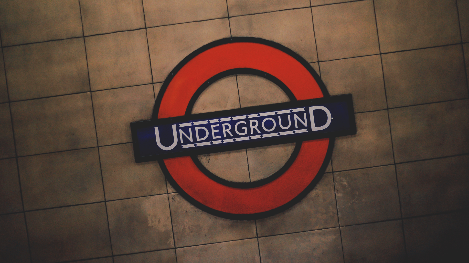
But an icon of London is the classic Tube’s Roundel, Font, and Map which are an instant visually to the London Underground, but when did they first come into existence, and how long have they been used? As a brand history goes, it’s defined, structured, and truly shows the strength of branding and vision.
Johnston’s Roundel
1915, the Underground’s publicity manager, commissioned the calligrapher Edward Johnston to design a company typeface. By 1917 the proportions of the roundel had been reworked to suit the new lettering and incorporate the Underground logotype. The solid red disc became a circle, and the new symbol was registered as a trademark.
By 1919 a standardised roundel symbol was being used on publicity. It began to appear on station exteriors and platform nameboards from the early 1920s.
In the 1920s, Johnston introduced exact guidelines for the reproduction of the roundel. The proportions of the bullseye, as he called it, were re-designed to incorporate the standardised company typeface.
Between 1920 and 1933, Johnston designed a variation of the roundel for each operating division of the Underground Group. This provided a unified identity for both rail and road services.
To discover more London Transport Museum visit https://www.ltmuseum.co.uk/
Ref: Geoff Marshall, London Transport Museum


